The photographs critiqued below were found in three online photography galleries. The first set is from a gallery by glen sheehan which shows scenes of "vanishing nevada". I chose this gallery because I like to visit out of the way places in Nevada and take pictures. The second set is by Julie B. Blencowe with scenes from Japan. I came across this gallery while looking for Blencowe genealogy web sites. I don't know the photographer, or if she is related to me. The third set is some winning photographs from a contest for students of scenes of Nevada.
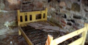
I'm at a lost as to why this blurry picture was put into an online photo gallery.
The picture consists of a bed in a stone cabin, the end lit by sunlight.
The picture would be uninteresting, even if the picture was in focus.
What was the photographer thinking?
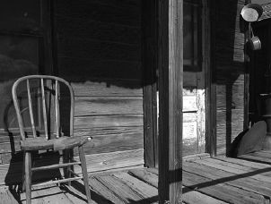
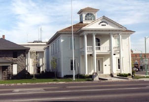
This is a very nice picture of a old wooden front porch.
It is sharp, showing detail of arrested decay of a ghost town.
This is a picture that would have been less effective in color.
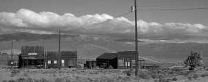
This is a very good shot of Gold Point, Nevada.
The photo shows the vast desolation surrounding the town.
The clouds make the picture more three dimensional.
If I had printed or processed this shot, I would have made it lighter,
to emphasize the sun and heat of the desert.
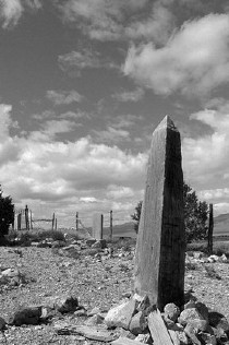
Lots of interesting sky to look at,
after you see the gave marker positioned in lower right of the photo.
The barbed wire fence in the background shows the reality of an old cemetery in the desert.
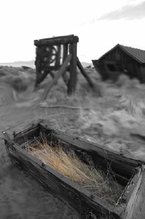
This picture irritates me a great deal.
In general, I don't like pictures that are partially black & white and color.
Most of the picture appears to have been blurred after the fact,
probably to emphasize the trough.
The sky, roof, and horizon appear in focus,
so the effect does not work for me.
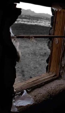
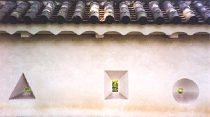
This picture works for me.
The old window, once covered in plastic, frames the desert outside.
I think it would have worked if the outside was left in color,
but the difference is subtle.
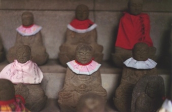
This picture makes me wonder about other cultures,
specificly, why do gods need bibs?
I assume that the picture lost clarity from compression for the Internet.
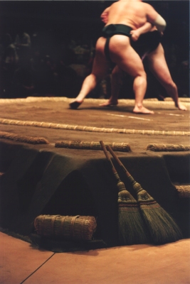
I like this one.
The point of the photo is not the wrestlers, but the brooms half in shadow.
Perhaps the audience in the background should not have been darken as much,
but the picture is very effective the way it is.
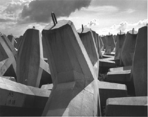
Rows of big things works for me.
Although, some frame of reference for size might help,
but that might make you wonder less, if you knew the size.
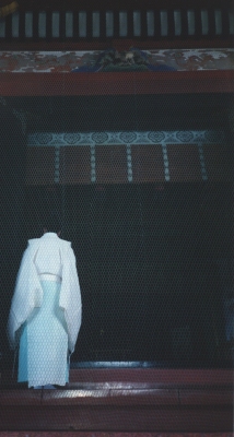
This is too dark for me.
I don't know if the picture was made dark to bring out the detail of the robe,
or to eliminate other distracting details in
the background.
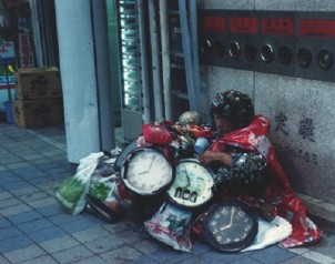
It looks like the United States does not have a monopoly on eccentric homeless people.
I think it is notable that the three big clocks show the same time.
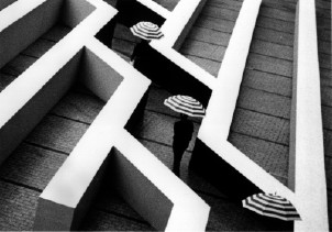
This looks like a clichè art photo from the sixties.
It is easy to assume that the umbrella holders were staged.
This picture looks unreal to me, more of a painting than a photo.
I don't know how the lighting in the windows was achieved.
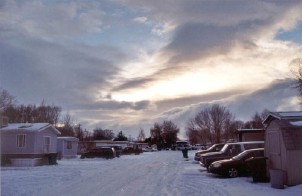
Grand Prize - Scenic Beauty: Blair Empey
This picture reminds one that the word Nevada mean snow in Spanish.
There can be beautiful skies in the winter.
Some people in Nevada live in trailer trash parks.
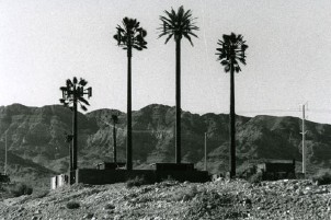
Grand Prize - Scenic Blight: Matt Star
This picture raises the question of what's worst, palm trees where they don't naturally grow,
or cellular towers made out to look like palm trees?
First Place, Grades 9-12: Christopher Taylor
At first I didn't like this one, with its mixture of natural beauty and automotive blight.
But, the cars put the size of the scene into perspective, and parking lots next to scenic area are so common and typical.
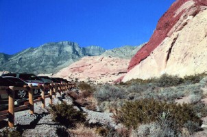
Third Place, Grades 9-12: Sean Cottle
I would have cropped this picture to get rid of the highway in the foreground and right.
Also, either crop the half building on the right, or include the whole thing.